Recently on Twitter, data visualization guru Edward R. Tufte wrote that graphics produced by R are not “publication ready”. His proposed workflow is to use statistical software to create an initial version of a plot, and then make final improvements in Adobe Illustrator.
I disagree with this advice. First I’ll show the steps a data analyst might take to create a high-quality graphic entirely in R. Then, I’ll explain why I think this is a better approach.
Publication quality graphics in R
Page 158 of Tufte’s classic book, The Visual Display of Quantitative
Information (2nd ed.),
features a “slope graph” that shows the change in government receipts
for several countries between 1970 and 1979. Below are the first few
rows of these data in a tidy data
frame, receiptData,
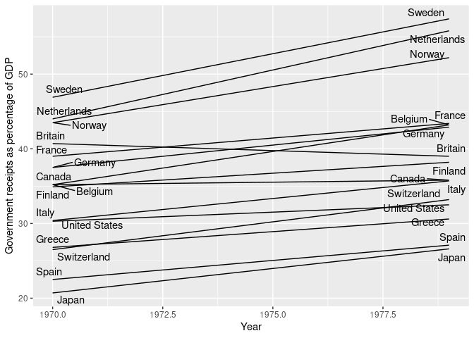
along with a quick and dirty slopegraph.
| country | year | receipts |
|---|---|---|
| Belgium | 1970 | 35.2 |
| Belgium | 1979 | 43.2 |
| Britain | 1970 | 40.7 |
| Britain | 1979 | 39.0 |
| Canada | 1970 | 35.2 |
| Canada | 1979 | 35.8 |
ggplot(receiptData, aes(year, receipts, group = country)) +
    geom_line() +
    geom_text_repel(aes(label = country)) +
    labs(x = "Year", y = "Government receipts as percentage of GDP")

This plot is not attractive, but it is useful for getting a handle on the data. Whether iterating through an exploratory data analysis or preparing a graphic for publication, analysts will create many ugly graphics on the path to settling on a design and refining it.
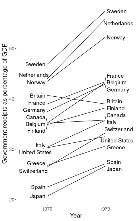
For our first round of improvements, we can change the aspect ratio of the graphic and arrange the country labels so they don’t overlap with the data. We should also remove the “chart junk” in the background, such as the background grid, and label only the years of interest on the x-axis.
ggplot(receiptData, aes(year, receipts, group = country)) +
    geom_line() +
    geom_text_repel(aes(label = country),
                    data = filter(receiptData, year == 1970),
                    nudge_x = -0.5, hjust = 1,
                    direction = "y", size = 5) +
    geom_text_repel(aes(label = country),
                    data = filter(receiptData, year == 1979),
                    nudge_x = 0.5, hjust = 0,
                    direction = "y", size = 5) +
    scale_x_continuous(breaks = c(1970, 1979), limits = c(1966, 1983)) +
    theme(panel.background = element_blank(),
          axis.title = element_text(size = 16),
          axis.text = element_text(size = 12)) +
    labs(x = "Year", y = "Government receipts as percentage of GDP")

The ggrepel package has done a
great job preventing the labels from overlapping; I usually use
geom_text_repel() instead of geom_text() during exploratory data
analysis. Here, however, the segments connecting the labels to data
points create confusing clutter. While these can be removed within the
function, our final figure will be easier to understand if we nudge
labels manually so that they’re as close to their data as possible.
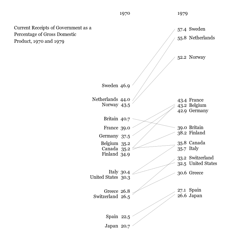
We can also drop the axes; the year labels will go right above the data, and we’ll show each country’s value next to its label. Since we’re losing the axis titles, we’ll also embed a caption in this version of the graphic.
Finally, we’ll change the typeface. Since we’re trying to make something
that would please Tufte, we’ll use a serif font. If you haven’t done so
before, you may need to run loadfonts() from the extrafont
package to tell R how to find system
fonts. We’ll also further boost our “data-ink ratio” by making the lines
thinner.
labelAdjustments <- tribble(
                                ~country, ~year, ~nudge_y,
                           "Netherlands", 1970L,      0.3,
                                "Norway", 1970L,     -0.2,
                               "Belgium", 1970L,      0.9,
                                "Canada", 1970L,     -0.1,
                               "Finland", 1970L,     -0.8,
                                 "Italy", 1970L,      0.4,
                         "United States", 1970L,     -0.5,
                                "Greece", 1970L,      0.4,
                           "Switzerland", 1970L,     -0.3,
                                "France", 1979L,      0.8,
                               "Germany", 1979L,     -0.7,
                               "Britain", 1979L,      0.1,
                               "Finland", 1979L,     -0.1,
                                "Canada", 1979L,      0.4,
                                 "Italy", 1979L,     -0.5,
                           "Switzerland", 1979L,      0.2,
                         "United States", 1979L,     -0.1,
                                 "Spain", 1979L,      0.3,
                                 "Japan", 1979L,     -0.2
                        )

receiptData <- left_join(receiptData, labelAdjustments,
                         by = c("country", "year")) %>%
    mutate(receipts_nudged = ifelse(is.na(nudge_y), 0, nudge_y) + receipts)

update_geom_defaults("text", list(family = "Georgia", size = 4.0))
ggplot(receiptData, aes(year, receipts, group = country)) +
    # Slope lines
    geom_line(size = 0.1) +
    # Country names (manually nudged)
    geom_text(aes(year, receipts_nudged, label = country),
              data = filter(receiptData, year == 1970),
              hjust = 1, nudge_x = -3) +
    geom_text(aes(year, receipts_nudged, label = country),
              data = filter(receiptData, year == 1979),
              hjust = 0, nudge_x = 3) +
    # Data values
    geom_text(aes(year, receipts_nudged, label = sprintf("%0.1f", receipts)),
              data = filter(receiptData, year == 1970),
              hjust = 1, nudge_x = -0.5) +
    geom_text(aes(year, receipts_nudged, label = sprintf("%0.1f", receipts)),
              data = filter(receiptData, year == 1979),
              hjust = 0, nudge_x = 0.5) +
    # Column labels
    annotate("text", x = c(1970, 1979) + c(-0.5, 0.5),
             y = max(receiptData$receipts) + 3,
             label = c("1970", "1979"),
             hjust = c(1, 0)) +
    # Plot annotation
    annotate("text", x = 1945, y = 58, hjust = 0, vjust = 1,
             label = paste("Current Receipts of Government as a",
                           "Percentage of Gross Domestic\nProduct, 1970 and 1979",
                            sep = "\n"),
             family = "Georgia", size = 4.0) +
    coord_cartesian(xlim = c(1945, 1990)) +
    theme(panel.background = element_blank(),
          axis.title = element_blank(),
          axis.text = element_blank(),
          axis.ticks = element_blank())

Why it’s worth it
It took several iterations to get the aesthetics of this plot just right, while an adept user of a graphics editor would be able to recreate it in minutes. However, this initial time savings obscures several advantages to completing this process in code as opposed to switching to a tool like Illustrator.
R is free software
All of the programs I used to create this graphic (and share it with you) are free software, unlike Adobe’s terrific but expensive Illustrator. Inkscape is an excellent open source alternative, but it is not as powerful as its commercial competitor. On the other hand, R is arguably the most advanced and well-supported statistical analysis tool. Even if the politics of the open source movement aren’t important, free is a better price-point.
Code can be reproduced
Anybody who wants to recreate the final figure using a different set of countries, a new pair of years, or a favored economic indicator can run the code above on their own data. With minimal tweaking, they will have a graphic with aesthetics identical to those above. Reproducing this graphic using a multi-tool workflow is more complicated; a novice would first need to learn how to create a “rough draft” of it in software, and then learn how to use a graphics editor to improve its appearance.
Scripted graphics are easier to update
Imagine that an analyst discovered a mistake in their analysis that needed to be corrected. Or imagine the less stressful situation where a colleague suggested replacing some of the countries in the figure. In such cases, the work of creating the graphic will need to be redone: the analyst will need to add data or correct errors, generate a new plot in software, and re-edit the plot in their graphics editor. Using a scripted, code-based workflow, the analyst would only need to do the first step, and possibly update some manual tweaks. The initial time savings afforded by a graphics editor disappears after the first time this happens.
Automation prevents errors
Not only does scripted workflow make it easier to deal with errors, it guards against them. When analysts adjust graphic elements in a GUI, there’s a risk of mistakenly moving, deleting, or mislabeling data points. Such mistakes are difficult to detect, but code-based workflows avoid these risks; if the data source and analysis are error-free, then the graphic will also be.
These considerations are among the reasons why scripted analyses are considered best practice in statistical analysis. Most of Tufte’s advice on creating graphics is excellent, but I recommend ignoring his suggestion to make the final edits in a program like Illustrator. Learning how to make polished graphics in software will ultimately save analysts time and help them avoid mistakes.