Bar charts are rightfully criticized for being potentially misleading, but they’re still useful for some data graphics. They’re a great way to display counts, for example, and non-technical audiences are comfortable interpreting them.
One way that a typical bar plot can be improved is by removing
unnecessary axis labels and directly labeling the bars themselves. For
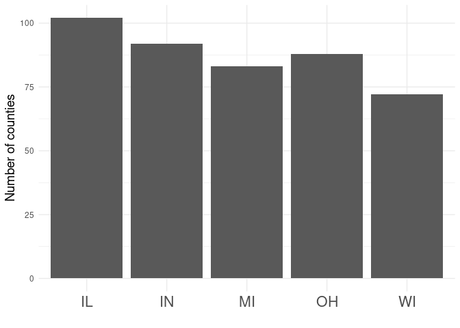
example, if we wanted to see how many counties are in some of the states
comprising the Midwestern US, we could use the midwest data set that’s
packaged with ggplot2 and draw a simple bar plot.
library(ggplot2)

ggplot(midwest, aes(x = state)) +
  geom_bar() +
  labs(x = "", y = "Number of counties") +
  theme_minimal() +
  theme(axis.text.x = element_text(size = 16),
        axis.title.y = element_text(size = 14))

This is fine (provided that you can accept that Ohio is part of the
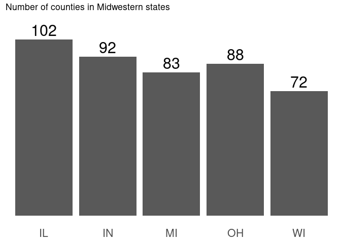
Midwest and Iowa isn’t). However, we can easily strip away some of the
“chart junk” by removing unnecessary theme elements and labeling the
bars using geom_text.
ggplot(midwest, aes(state)) +
  geom_bar() +
  geom_text(aes(y = ..count.., label = ..count..), stat = "count",
            vjust = 0, nudge_y = 2, size = 8) +
  expand_limits(y = 110) +
  theme(panel.background = element_blank(),
        panel.grid = element_blank(),
        axis.line = element_blank(),
        axis.ticks = element_blank(),
        axis.title = element_blank(),
        axis.text.y = element_blank(),
        axis.text.x = element_text(size = 16)) +
  labs(title = "Number of counties in Midwestern states")

There’s still room for improvement—I’d consider rearranging the bars based on something more meaningful than alphabetic order, and possibly coloring them—but this simultaneously conveys more information than the previous plot (objectively) and is less “cluttered” (subjectively).
How this works
I’m surprised I’m still writing blog posts about ggplot2 after seven
years, but I continue to learn new things about it even after regular
use. Recently, I decided that it bothered me that there were “stats”
(like stat_ecdf) and “geoms” (like geom_bar), and I really didn’t
understand the difference between them—they seemed interchange but not
identical. I finally looked into it and came across this response on
StackOverflow, which contained
the following quote from the ggplot2 book:
You only need to set one of stat and geom: every geom has a default stat, and every stat has a default geom.
It turns out that “stats” and “geoms” are largely interchangeable,
because they’re both wrappers around layer(), with different ways of
handling defaults. The code above works because I changed the stat
parameter of geom_text (which, according to the
documentation,
defaults to "identity") to "count", which is the default stat of
geom_bar. Looking at the documentation for
stat_count, we
see that it provides two computed variables, and we use use the
computed count variable in our aesthetics for geom_text to provide
both the vertical position and label.
Getting my head around this has helped me iterate through analyses more
quickly. For instance, I frequently use stat_ecdf to get a handle on
distributions, and now I can label these plots easily. Sticking with
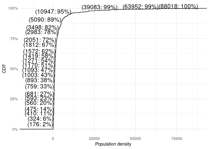
data about the Midwest, here’s the ECDF of population density for
Midwestern counties, with a few values highlighted.
ggplot(midwest, aes(popdensity)) +
  stat_ecdf() + # This could also be `geom_step(stat = "ecdf")`
  geom_text(aes(label = sprintf("(%.0f: %.0f%%)", ..x.., floor(100 * ..y..))),
            stat = "ecdf", hjust = 1, vjust = 0, check_overlap = TRUE, size = 5) +
  expand_limits(x = -15000) +
  scale_y_continuous(labels = scales::label_percent()) +
  theme_minimal() +
  labs(x = "Population density", y = "CDF")

I wouldn’t call this a beautiful graphic, but visualizations like this are often useful, especially when getting a handle on a new data set. Here we see that over a third of Midwestern counties have population densities fully two orders of magnitude smaller than the most densely populated county, and we’ve only had to draw a single plot.
It’s hard to justify putting much effort into producing plots that aren’t meant to be shared, and a typical data analysis will involve creating dozens of plots that are only useful for the person analyzing the data. Without understanding stats and geoms, I would never have bothered labeling an ECDF plot; “quick and dirty” needs to be quick after all. On the other hand, labeling the values in a bar chart is something that one should do when preparing publication-quality graphics. GGplot2 is useful in both phases of a project.
In the words of Alan Kay, “simple things should be simple, complex things should be possible.” GGplot2 does both of these consistently. Occasionally, it even makes complex things simple.