Anybody who’s used the ggplot2 package in R is probably familiar with
geom_violin, which creates violin
plots. I’m not going to reproduce
the Wikipedia article here; just think of violin plots as sideways density
plots (which themselves are basically smooth histograms). They look like this:
library(ggplot2)
ggplot(mtcars, aes(x = factor(cyl), y = mpg, fill = factor(cyl))) +
  geom_violin()
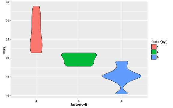
I wasn’t familiar with this type of plot until I started using ggplot2. Judging by a recent conversation with friends (because my friends and I are nerds), that’s not uncommon among people coming from psychology (but check out Figure 1 in the recent report on reproducability in psychology by the Open Science Collaboration).
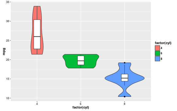
That’s a shame, because this is a useful technique; a quick glance shows viewers the shape of the distribution and lets them easily estimate its mode and range. If you also need the median and interquartile range, it’s simple to display them by overlaying a box plot (violin plots are usually made this way).
ggplot(mtcars, aes(x = factor(cyl), y = mpg)) +
  geom_violin(aes(fill = factor(cyl))) +
  geom_boxplot(width = 0.2)
Violin plots vs. bar graphs
Violin plots aren’t popular in the psychology literature–at least among vision/cognition researchers. Instead, it’s more common to see bar graphs, which throw away all of the information present in a violin plot.
library(dplyr)
mtcarsSummary <- mtcars %>%
  group_by(cyl) %>%
  summarize(mpg_mean = mean(mpg),
            mpg_se = sqrt(var(mpg)/length(mpg)))

ggplot(mtcarsSummary, aes(x = factor(cyl), y = mpg_mean, fill = factor(cyl))) +
  geom_bar(stat = "identity")
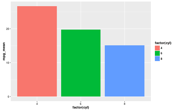
Bar graphs highlight a single statistic of the analyst’s choosing. In psychology (and many other fields), researchers use bar graphs to visualize the mean of the data, and usually include error bars to show the standard error (or another confidence interval).
However, when audiences see bar graphs of means, they erroneously judge values that fall inside a bar (i.e., below the mean) as more probable than values equidistant from the mean but outside a bar (Newman & Scholl, 2012). This bias doesn’t affect violin plots because the region inside the violin contains all of the observed data. I’d guess that observers will correctly intuit that values in the wider parts of the violin are more probable than those in narrower parts.
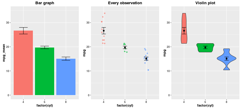
The mean and standard error are only useful statistics when you assume that your data are normally distributed; bar graphs don’t help you check that assumption. For small sample size studies, it’s more effective to just plot every single observation (Weissgerber et al., 2015). Till Bergmann explored this approach in a post that includes R code.
If it’s important to display the mean and standard error, these values can be overlaid on any visualization.
library(gridExtra)

plotBars <- ggplot(mtcarsSummary, aes(x = factor(cyl), y = mpg_mean, fill = factor(cyl))) +
  geom_bar(aes(fill = factor(cyl)), stat = "identity") +
  geom_errorbar(aes(y = mpg_mean, ymin = mpg_mean-mpg_se, ymax = mpg_mean+mpg_se),
                color = "black", width = 0.4) +
  ylim(0, 35) +
  theme(legend.position = "none") +
  ggtitle("Bar graph")

plotPoints <- ggplot(mtcars, aes(x = factor(cyl), y = mpg, color = factor(cyl))) +
  geom_point(aes(y = mpg, color = factor(cyl)),
             position = position_jitter(width = 0.25, height = 0.0),
             alpha = 0.6) +
  geom_point(aes(y = mpg_mean), color = "black", size = 2, data = mtcarsSummary) +
  geom_errorbar(aes(y = mpg_mean, ymin = mpg_mean-mpg_se, ymax = mpg_mean+mpg_se),
                color = "black", width = 0.2, data = mtcarsSummary) +
  ylim(0, 35) +
  theme(legend.position = "none") +
  ggtitle("Every observation")

plotViolins <- ggplot(mtcars, aes(x = factor(cyl), y = mpg, fill = factor(cyl))) +
  geom_violin(aes(y = mpg, fill = factor(cyl))) +
  geom_point(aes(y = mpg_mean), color = "black", size = 2, data = mtcarsSummary) +
  geom_errorbar(aes(y = mpg_mean, ymin = mpg_mean-mpg_se, ymax = mpg_mean+mpg_se),
                color = "black", width = 0.2, data = mtcarsSummary) +
  ylim(0, 35) +
  theme(legend.position = "none") +
  ggtitle("Violin plot")

grid.arrange(plotBars, plotPoints, plotViolins, ncol = 3)
Violin plots vs. density plots
A violin plot shows the distribution’s density using the width of the plot, which is symmetric about its axis, while traditional density plots use height from a common baseline. It may be easier to estimate relative differences in density plots, though I don’t know of any research on the topic. More importantly, density plots (or histograms) readily display the density estimates, whereas violin plots typically don’t present these.
ggplot(mtcars, aes(x = mpg, fill = factor(cyl))) +
  geom_density(alpha = 0.6)
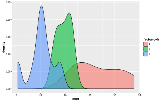
Figures like the one above quickly become crowded as the number of factors increases. It’s easy to flip the coordinates and use faceting to construct figures similar to violin plots.
# trim = TRUE trims the tails to the range of the data,
# which is the default for geom_violin
ggplot(mtcars, aes(x = mpg, fill = factor(cyl))) +
  geom_density(trim = TRUE) +
  coord_flip() +
  facet_grid(. ~ cyl)
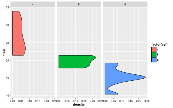
I asked twitter about making plots like this without faceting. David Robinson came through with a new geom that does it. Like traditional violin plots, these toss out the density estimates–and currently only work with the development version of ggplot2–but they do the trick.
ggplot(mtcars, aes(x = factor(cyl), y = mpg, fill = factor(cyl))) +
    geom_flat_violin()
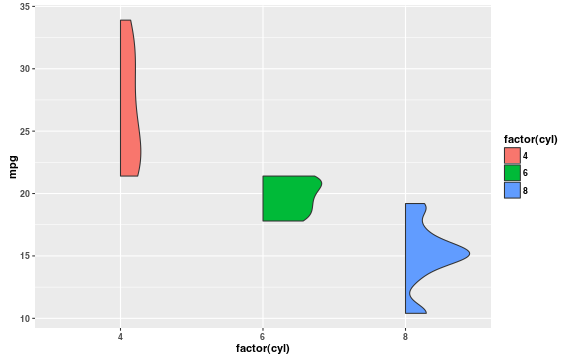
Use violin plots
If you’re into R’s base graphics (why?), it looks like the vioplot package can make violin plots without using ggplot2. Seaborn appears to bring very powerful violin plots to python, but I haven’t had much opportunity to explore the awesome pandas world that’s emerged since I last used python for most of my analyses.
Psychologists should use violin plots more often. They’re ideal for displaying non-normal data, which we frequently encounter when looking at a single participant’s performance (e.g., response times). More importantly, previous research–in psychology–has shown that viewers have difficulty interpreting bar graphs, and violin plots present a viable alternative.