Andy Bell from Set Studio shared the outcome of a study of browser viewport sizes; the area of the screen (measured in pixels) available for web pages. They shared the data so I thought I’d take a quick look at it.
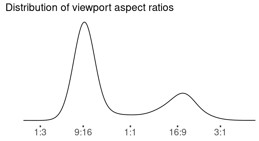
First let’s check the distribution of aspect ratios. With mobile browsing more popular than desktop, I expect tall displays to dominate the wide ones, but what do the data say?

As expected, tall (narrow) displays dominate the distribution, bu the peak also seems sharper. This isn’t surprising; phone screens come in a few discrete sizes, and for each phone screen, there is a small number of viewports (but, importantly, more than one) associated with each one.
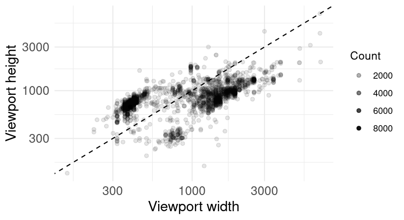
How do the distribution of height and width relate to each other? I’ll plot a point for each unique viewport, and set the alpha value of each point to the number of observations of that specific size. Points above and to the left of the dashed line are taller than they are wide (i.e., “portrait mode”), and those below and to its right are wider than tall (“landscape mode”). We confirmed that tall viewports are the most common by looking at aspect ratios, but how are the specific sizes distributed?

I feel like my eye detects three clusters of height-by-width combinations, but k-means is clustering these unreliably—sometimes the “small wide” viewports get clustered alone together, and sometimes they’re grouped with the “small tall” viewports. This suggests that three (and also four—I checked) clusters don’t describe these data particularly well.
However, taking these two graphics together, we can see that while tall displays tend to be smaller than wide ones in general (which is what we may expect, knowing that mobile browsers are more prevalent than desktop browsers), there are plenty of exceptions in the data set which should be considered during design.
I think there’s more to look at here, and I’ll update this if I find anyting interesting!